Contenido
- turbulence.Graph
- turbulence.Graph.time_series
- turbulence.Graph.windrose
- turbulence.Graph.anomalies_meaning_average
- turbulence.Graph.time_series_web
- turbulence.Graph.plotly_RidgelinePlot_web
- turbulence.Graph.fig_html_web
- turbulence.Graph.backup_figure
turbulence.Graph
class turbulence.Graph()
Class using as constructor of the interactive graphics employing bokeh and plotly library; and statics graphics employing matplotlib.pyplot. These graphs are mainly oriented to be used with data from class Sesor but it's possible to use it with other data if this contained in a dataframe object with characteristics given in each method
turbulence.Graph.time_series
turbulence.Graph.time_series(data = None, variables = None, style = 'Bokeh', kind = 'line', ylabel = None, name_graph = None, time_units = None, plot_height = 350, plot_width = 600, line_widths = 2, line_alphas = 1, legend_location = 'top_left', color = None, show_figure = False, save_figure = False)
Generate an interactive graph using the bokeh or static library using matplolib.pyplot. You can use any dataframe, including the turbulent variable information contained in the Sensor object
Parameters:
- data: DataFrame containing the time series by columns. The name of index should be 'TIMESTAMP'
- variables: Variable as str or List of variables to graph. If more than one variable is passed, they are graphed in the same plane
- style: Library to graphic, its options are: 'Bokeh' to interactive graphic with bokeh, or 'plt' to use matplotlib.pyplot
- kind: String type. Choose graph type, default is Line, its options are: 'line', 'step'
- ylabel: String type. Title of y axis, default is None.
- name_graph: String type. Title that will have the graph.
- time_units: String type. Time units of the graph
- plot_height: Choose the height of the graph, default 200.
- plot_width: Choose the width of the graph, default 600.
- line_widths: Int or a list with int to select the width of the lines.
- line_alphas: Int or a list with int to select the transparency of the lines.
- *legend_location: * List of colors. Default is a list of SIATA's colors. The list star with black, and next have SIATA's colors
- color: String type. Name used to identify the sensor in the database.
- show_figure: Default is False. Option to show or not the figure in the notebook
- save_figure: Default is False. Save the figure in the same level of the notebook or script in PDF format. Only to 'plt' style
Returns:
- Returns a HTML graph of the given variables using bokeh
- Returns the ax object created with matplotlib.pyplot
Examples
Creating random data to graphic
xxxxxxxxxximport turbulence as tblimport numpy as npimport pandas as pd#Dataframe with random dataindex = pd.date_range(start='2021-01-01', end='2021-02-15')columns = list('ABCDE')df = pd.DataFrame(np.random.rand(len(index),len(columns)), columns=columns, index = index) df.index.name = 'TIMESTAMP'df.head() A B C D ETIMESTAMP 2021-01-01 0.758538 0.324083 0.153662 0.342210 0.4983562021-01-02 0.044648 0.348006 0.230927 0.135567 0.0522852021-01-03 0.958152 0.370423 0.969999 0.147159 0.3478122021-01-04 0.606610 0.151699 0.654082 0.505528 0.1838922021-01-05 0.327732 0.242570 0.011946 0.083442 0.041856Interactive graph using bokeh
xxxxxxxxxxgraph = tbl.Graph() #Generating the Graph objecttime_series = graph.time_series(data = df, show_figure = True)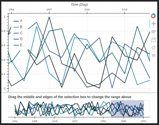
Static graph. All variables are graphics in the same space
xxxxxxxxxxtime_series = graph.time_series(data = df, style = 'plt', name_graph = 'Sample series', show_figure = True)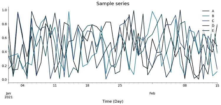
turbulence.Graph.windrose
turbulence.Graph.windrose(data = None, nsector = 16, style = 'plotly', lst_color = None, title = None, show_figure = False, save_figure = False)
Create an interactive windrose using plotly library or a static plot using matplotlib.pyplot
Parameters:
- data: Dataframe containing two columns with the direction and speed of the wind, an index in datetime format and the names of the columns are "direction" and "speed"
- nsector: Number of sectors into which you want to divide the windrose. Default is 16
- style: Library that you want to use to make the windrose. Options are 'plotly' for an interactive graph, or 'plt' to use the WindRose library
- kind: String type. Choose graph type, default is Line, its options are: 'line', 'step'
- lst_color: List of colors in hexadecimal format. SIATA colors are used by default
- show_figure: Default is False. Option to show or not the figure in the notebook
- save_figure: Default is False. Save the figure in the same level of the notebook or script. Only to 'plt' style
Returns:
- If style is 'plt', returns the ax object created with WindRose library
- If style is 'plotly', returns the interactive figure created with plotly
Examples
Creating random data to graphic
xxxxxxxxxximport turbulence as tblimport numpy as npimport pandas as pd#Dataframe with random dataindex = pd.date_range(start='2021-01-01', end='2021-02-15')columns = ['direction', 'speed']df = pd.DataFrame(np.random.rand(len(index),len(columns)), columns=columns, index = index)df.direction = df.direction * 100df.speed = df.speed * 10df.head() direction speed2021-01-01 21.872307 0.3018272021-01-02 90.461161 7.0831882021-01-03 64.340076 7.4083972021-01-04 26.599929 6.2541862021-01-05 56.810256 6.578352Interactive graph using plotly
xxxxxxxxxxgraph = tbl.Graph() #Generating the Graph objectwindrose = graph.windrose(data = df, show_figure = True)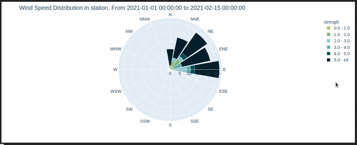
Static graph using WindRose
xxxxxxxxxxwindrose = graph.windrose(data = df, style = 'plt', show_figure = True)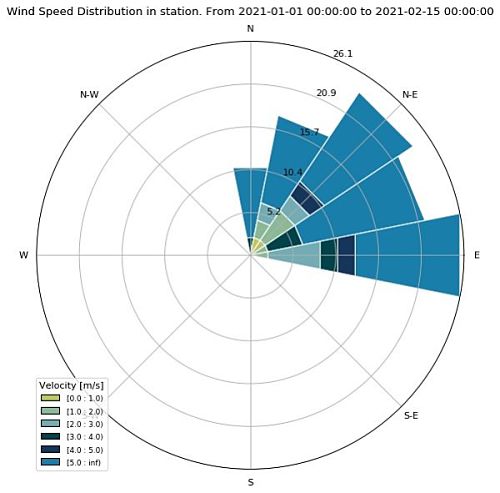
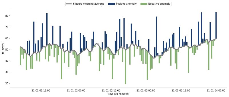
turbulence.Graph.anomalies_meaning_average
turbulence.Graph.anomalies_meaning_average(data = None, variables = ['LE', 'H', 'TAU'], period = '30T', units = ['W/m²', 'W/m²', 'N/m²'], window = 12, min_periods = 11, plot_width = 800, plot_height = 350, line_width = 4, bar_alpha = 1, style = 'Bokeh', show_figure = False, save_figure = False, path = None)
The database is resampled according to the 'period' parameter. The moving average is then calculated by taking a width window 'window' with a minimum of 'min_periods' data. Anomalies are calculated as: anomaly = (resampled data) - (moving average) The initial configuration is for processed data from EddyPro Parameters:
- data: By default it is the data of the object. It must be a DataFrame with the type DatetimeIndex, and columns with variable names, which must have the index name 'TIMESTAMP'
- variables: List with variables of interest for anomalies. Default are turbulent fluxes
- period: Used for resampling the database to smooth the series. Default is '30T'
- units: List of units for the variables of interest
- window: Integer with the data number for the mobile window. Default is 12 (Corresponding to 6 hours if period is '30T')
- min_periods: Minimum number of data to make the moving average. Default is 11
- plot_width: Choose the width of the graph, default 800
- plot_height: Choose the height of the graph, default 350
- line_widths: Int or a list with int to select the width of the lines
- bar_alpha: Int or a list with ints to select the transparency of the bars
- style: Library that you want to use to make the figure. Options are 'Bokeh' for an interactive graph, or 'plt' to use matplotlib.pyplot
- show_figure: Default is False. Option to show or not the figure in the notebook
- save_figure: Default is False. Only to 'plt' style
- path: Path to save the figure in PDF format
Returns:
- If style is 'Bokeh', then an interactive figure is returned with the anomalies as bars starting from the value of the moving average. Anomalies can be turned off by clicking on the legends. Also, a DataFrame with the data used for the figure is returned
- If style is 'plt', then a list of tuples is returned, each tuple has the figure and the ax object of the figure. Also, a DataFrame with the data used for the figure is returned
Examples
Creating random data to graphic
xxxxxxxxxximport turbulence as tblimport numpy as npimport pandas as pd#Dataframe with random dataindex = pd.date_range(start='2021-01-01', end='2021-01-04', freq = '5T')columns = ['LE', 'H', 'TAU']df = pd.DataFrame(np.random.rand(len(index),len(columns))*100, columns=columns, index = index)df.index.name = 'TIMESTAMP'df.head() LE H TAUTIMESTAMP 2021-01-01 00:00:00 73.787154 78.890860 37.3346272021-01-01 00:05:00 45.476565 97.376636 40.8641212021-01-01 00:10:00 79.536425 57.533989 44.3233932021-01-01 00:15:00 72.835109 98.125444 50.0451192021-01-01 00:20:00 85.315780 81.654879 42.771131Interactive graph using bokeh
xxxxxxxxxxgraph = tbl.Graph() #Generating the Graph objectmean, anomalies_fig = graph.anomalies_meaning_average(data = df, show_figure = True)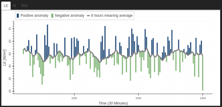
Static graph using matplotlib.pyplot to show the sensible heat 'H'
xxxxxxxxxxmean, anomalies_figs = graph.anomalies_meaning_average(data = df, style = 'plt', show_figure = True)
Using the same data but modify the period of smooth to 20 minutes and taking a window of 3 hours
xxxxxxxxxxmean, anomalies_figs = graph.anomalies_meaning_average(data = df, style = 'plt', period = '20T', window = 9, min_periods=8, show_figure = True)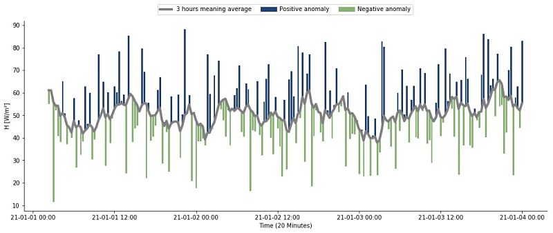
turbulence.Graph.time_series_web
turbulence.Graph.windrose(data = None, style = 'Bokeh', show_figure = False)
This function uses time_series and graph_AllVariables to generate the graphs used on the COMPLEX campaign website. View them at https://siata.gov.co/COMPLEX/Website/ by selecting the "Go to diagnostics" button on each station.
Parameters:
- data: By default it is the data of the object. It must be a DataFrame with the type DatetimeIndex, and columns with variable names, which must have the index name 'TIMESTAMP'
- style: Library that you want to use to make the figure. Options are 'Bokeh' for an interactive graph, or 'plt' to use matplotlib.pyplot
- show_figure: Default is False. Option to show or not the figure
Returns:
- If style is 'Bokeh', returns a set of interactive graphics that are displayed on the website of the COMPLEX campaign
- If style is 'plt', Generates graphs in pdf format of the variables of interest with record of the last 6, 12 and 24 hours, these are saved here1
turbulence.Graph.plotly_RidgelinePlot_web
turbulence.Graph.plotly_RidgelinePlot_web(data = None, variables = None, title = None, legend = False, color = None, fig_size = None, html_save = False, show_figure = False)
The ridgeline plot allows us to study the distribution of the numerical variables of interest. For this case, the following have been selected: 'TAU', 'Ux', 'Uy', 'Uz', 'WS', 'WS_MAX', 'T_SONIC', 'H2O_density', read from EasyFlux, but you can use data that has the format of dataframe described
Parameters:
- data: By default it is the data of the object. It must be a DataFrame with the type DatetimeIndex, and columns with variable names, which must have the index name 'TIMESTAMP'
- variables: String list with variables for which distribution is required
- title: Library that you want to use to make the figure. Options are 'Bokeh' for an interactive graph, or 'plt' to use matplotlib.pyplot
- legend: Library that you want to use to make the figure. Options are 'Bokeh' for an interactive graph, or 'plt' to use matplotlib.pyplot
- color: Library that you want to use to make the figure. Options are 'Bokeh' for an interactive graph, or 'plt' to use matplotlib.pyplot
- fig_size: Default is False. Option to show or not the figure
- html_save: Bool. Default is False, if it's changed to True then saved a HTML file
- show_figure: Default is False. Option to show or not the figure
Returns:
- Creates a standalone HTML that is saved locally and opened inside your web browser. More information here
Examples
Creating random data to graphic
xxxxxxxxxximport turbulence as tblimport numpy as npimport pandas as pd#Dataframe with random dataindex = pd.date_range(start='2021-01-01', end='2021-01-31', freq = '5T')distributions = {'normal': np.random.normal(size = len(index)), 'uniform': np.random.uniform(size = len(index)), 'power':np.random.power(3,size = len(index)), 'weibull':np.random.weibull(5, size = len(index)), 'poisson':np.random.poisson(5, size = len(index))}df = pd.DataFrame(data = distributions, index = index)df.index.name = 'TIMESTAMP'df.head() normal poisson power uniform weibullTIMESTAMP 2021-01-01 00:00:00 0.628836 8 0.920784 0.679841 1.0529522021-01-01 00:05:00 0.405619 6 0.166144 0.163154 0.7200982021-01-01 00:10:00 0.153764 4 0.301181 0.613829 1.1977492021-01-01 00:15:00 0.984777 3 0.779014 0.422416 0.7650742021-01-01 00:20:00 -1.275737 5 0.898457 0.345466 1.201293Interactive graph using plotly
xxxxxxxxxxgraph = tbl.Graph() #Generating the Graph objecttag_divs = graph.plotly_RidgelinePlot_web(data = df, variables = df.columns.to_list(), show_figure = True)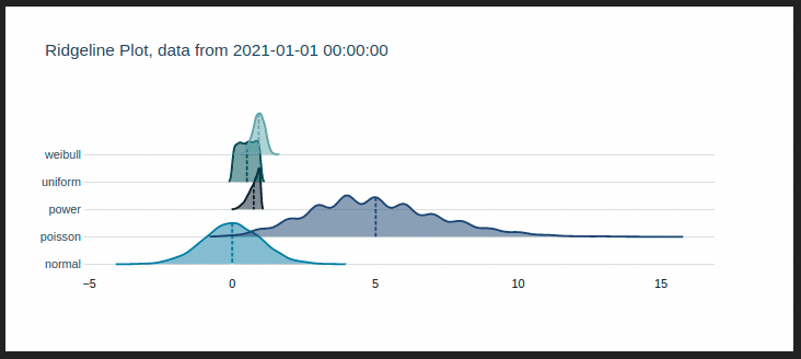
turbulence.Graph.fig_html_web
turbulence.Graph.fig_html_web(lst_figs_bokeh, lst_caption_bokeh, lst_figs_plotly, lst_caption_plotly, path = None)
Save interactive figures created with bokeh or plotly in .html format2
Parameters:
- data: By default it is the data of the object. It must be a DataFrame with the type DatetimeIndex, and columns with variable names, which must have the index name 'TIMESTAMP'
- variables: String list with variables for which distribution is required
- title: Library that you want to use to make the figure. Options are 'Bokeh' for an interactive graph, or 'plt' to use matplotlib.pyplot
- legend: Library that you want to use to make the figure. Options are 'Bokeh' for an interactive graph, or 'plt' to use matplotlib.pyplot
- color: Library that you want to use to make the figure. Options are 'Bokeh' for an interactive graph, or 'plt' to use matplotlib.pyplot
- fig_size: Default is False. Option to show or not the figure
- html_save: Bool. Default is False, if it's changed to True then saved a HTML file
- show_figure: Default is False. Option to show or not the figure
Returns:
- Creates a standalone HTML that is saved locally and opened inside your web browser. More information here
Examples
Generating the random data for the bokeh and plotly figures
xxxxxxxxxximport turbulence as tblimport numpy as npimport pandas as pd#Dataframe with random dataindex = pd.date_range(start='2021-01-01', end='2021-01-31')columns = list('ABCDE')distributions = {'normal': np.random.normal(size = len(index)), 'uniform': np.random.uniform(size = len(index)), 'power':np.random.power(3,size = len(index)), 'weibull':np.random.weibull(5, size = len(index)), 'poisson':np.random.poisson(5, size = len(index))}df_plotly = pd.DataFrame(data = distributions, index = index)df_bokeh = pd.DataFrame(np.random.rand(len(index),len(columns)), columns=columns, index = index) df_plotly.index.name, df_bokeh.index.name = 'TIMESTAMP', 'TIMESTAMP'Creating the figures, saving in lists and making the captions and saving HTML file
xxxxxxxxxxgraph = tbl.Graph() #Generating the Graph objecttime_series = graph.time_series(data = df_bokeh)tag_divs = graph.plotly_RidgelinePlot_web(data = df_plotly, variables = df_plotly.columns.to_list())lst_caption_bokeh = ['1. Time series created with bokeh library']lst_caption_plotly = ['2. Ridgeline plot created with plotly library']lst_figs_bokeh = [time_series]lst_figs_plotly = [tag_divs]graph.fig_html_web(lst_figs_bokeh, lst_caption_bokeh, lst_figs_plotly, lst_caption_plotly) 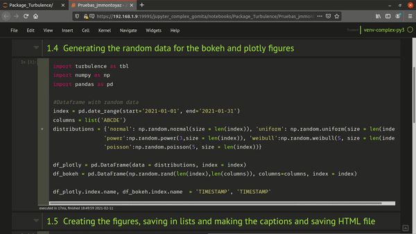
turbulence.Graph.backup_figure
turbulence.Graph.backup_figure()
This method is employed just with the Sensor object and generate the figure used in backups process